New Arrivals at Margraf USA: A Designer’s Field Guide
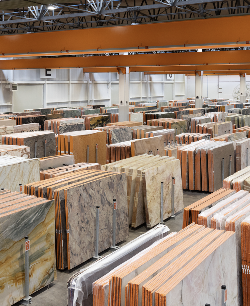
When the right stone lands in the right project, the space feels effortless, it simply works. Light runs clean across a surface, a vein leads the eye, a texture softens the acoustics. This first installment focuses on light, nature‑forward tones and the blue/green spectrum, materials that bring clarity, calm, and biophilic energy to kitchens, baths, and communal spaces.
Bright Neutrals that Work Hard
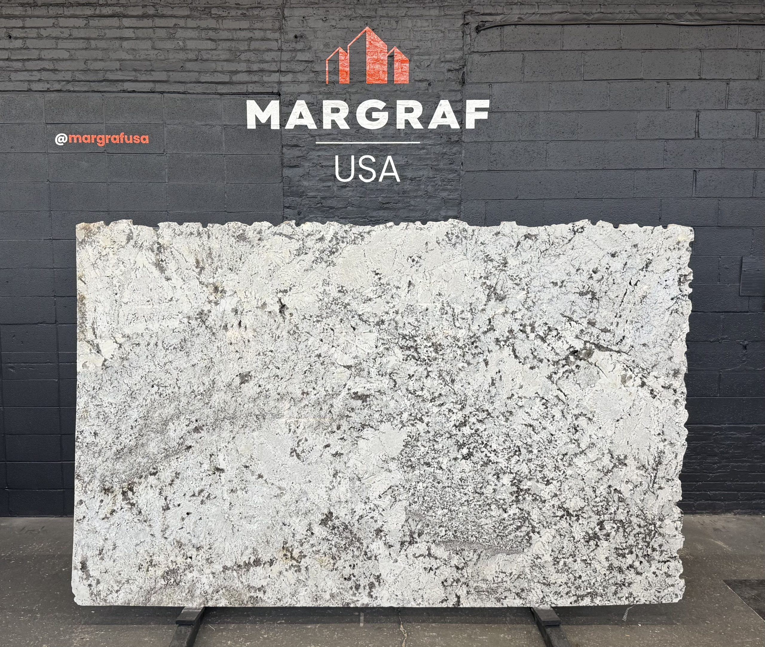
– Alaska White: Cool white to soft grey with peppery inclusions; Brazilian‑quarried granite and a reliable pick for bright kitchens that still feel natural, with movement that reads beautifully on large islands and range splashes. A safe choice and highly recommended for islands/perimeters, vanities, fireplace surrounds, select outdoor use (finish‑dependent).
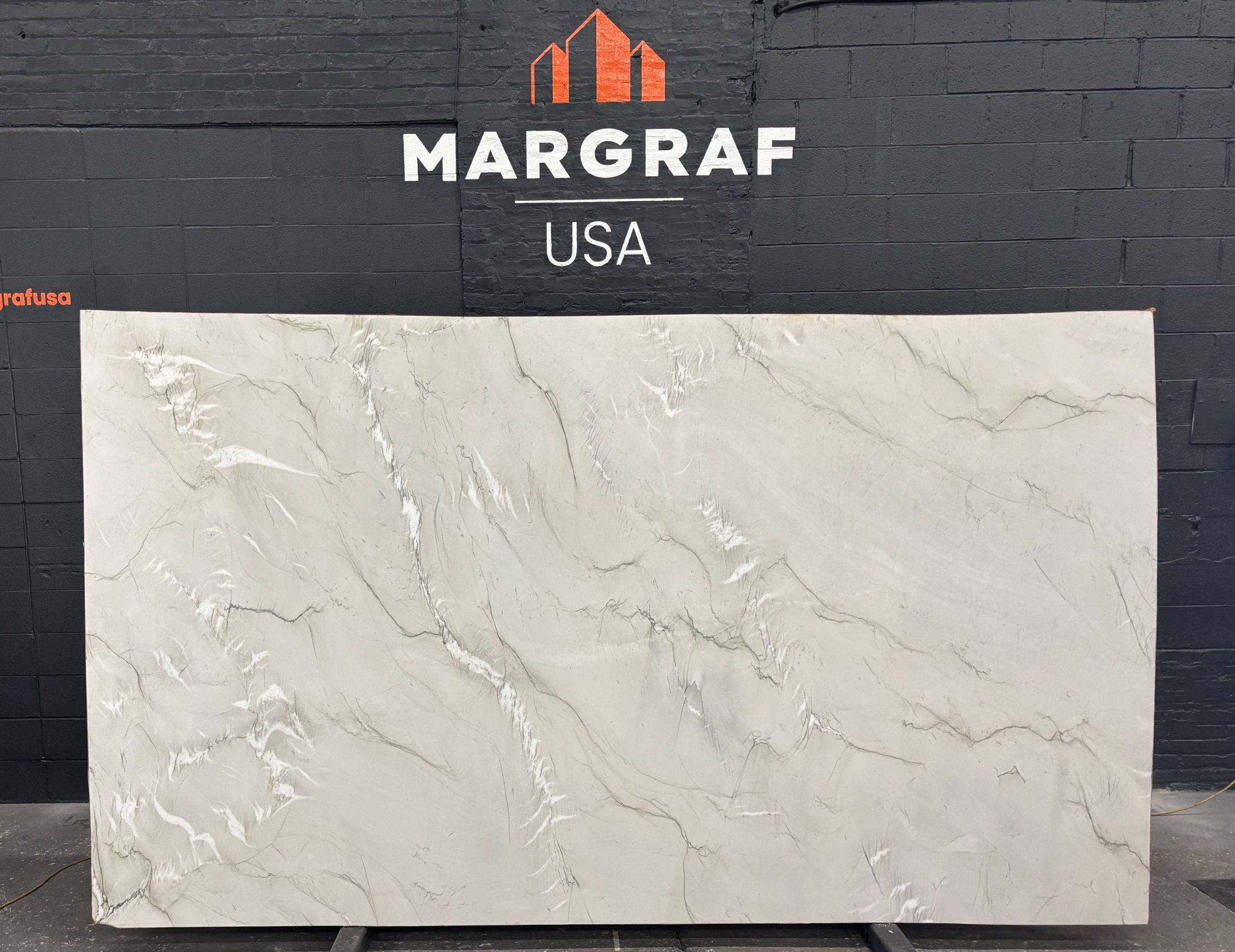
– Mont Blanc: A luminous white quartzite that lifts light and line in pared‑back schemes; polished reads crisp without glare. Best for: minimalist kitchens, spa‑quiet baths, tall backsplash runs.
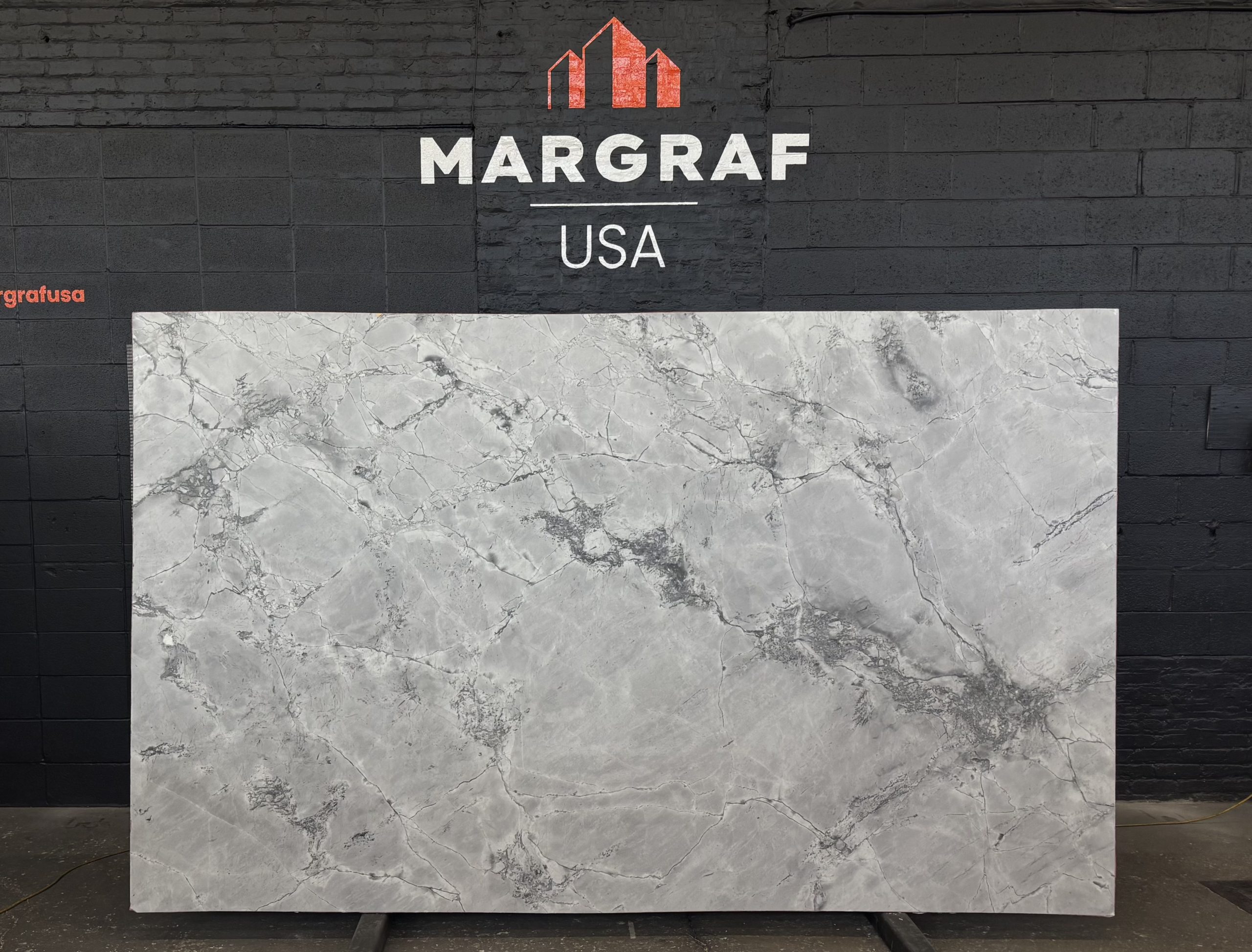
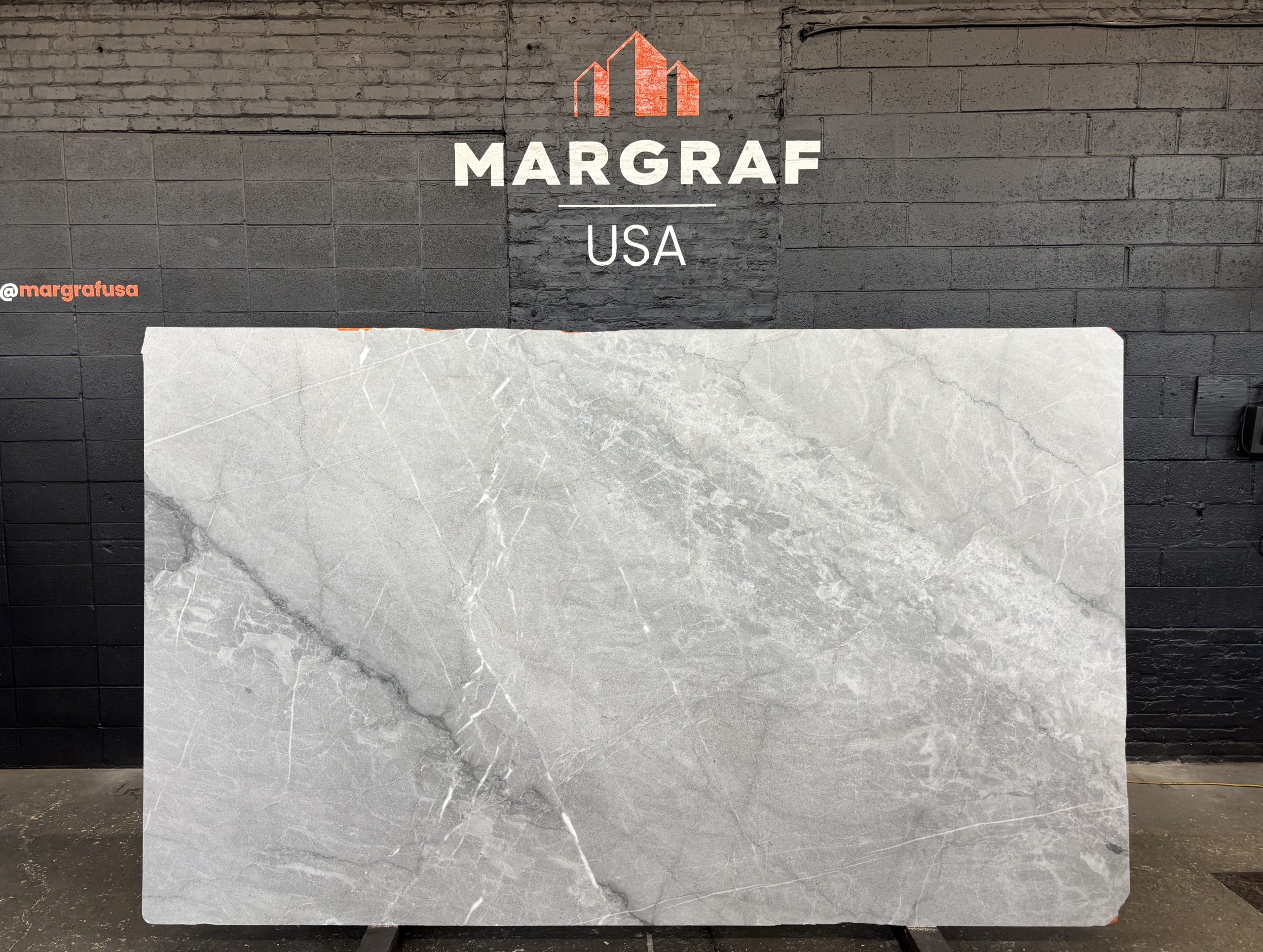
– Super White: Pale, elegant marble when you want resilience without visual noise in kitchens and bathrooms. Choose honed or brushed finishes for low‑glare, tactile counters. Best for: hard‑working kitchens and baths where subtlety matters.
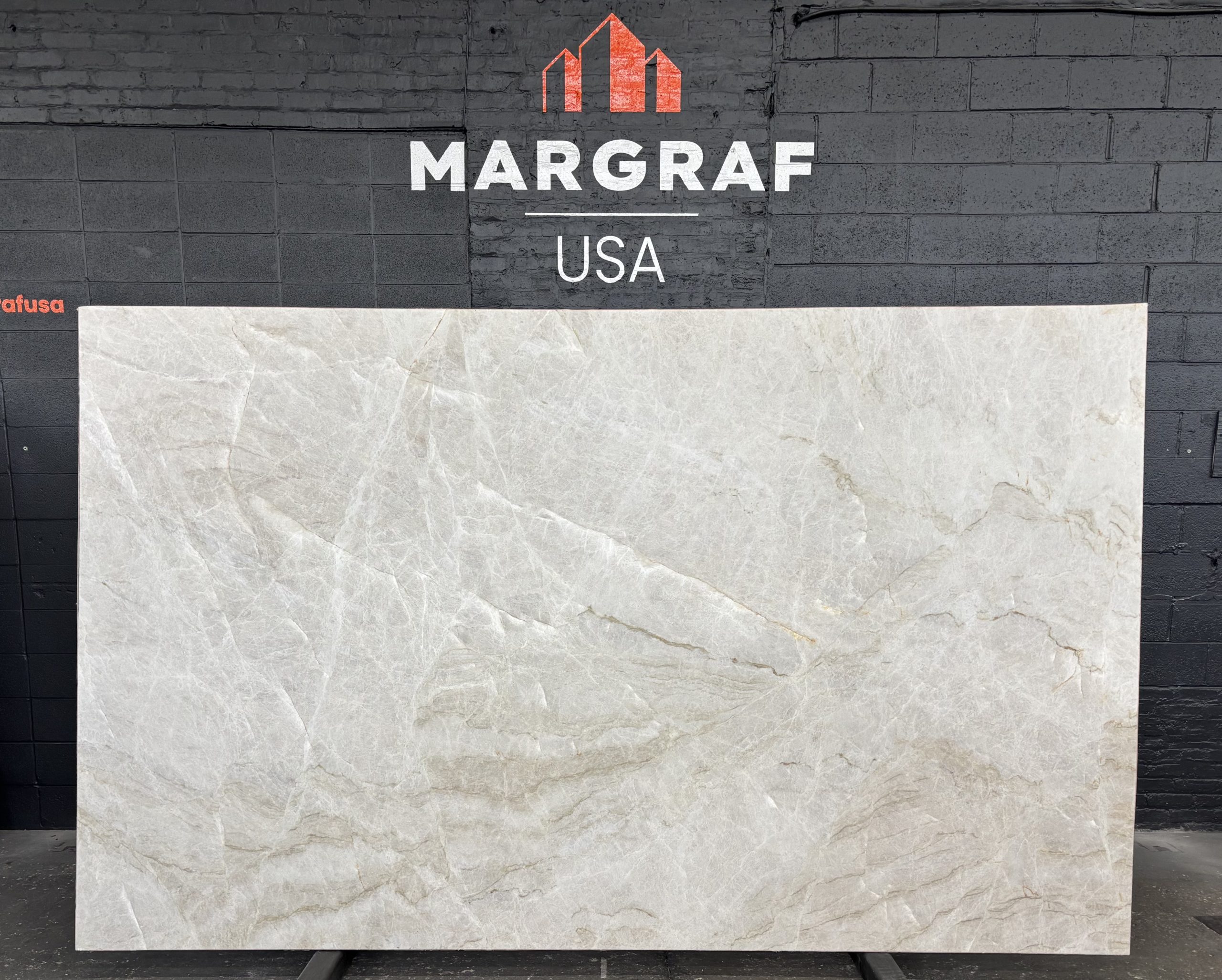
– Taj Mahal: The soft‑beige crowd‑pleaser from Brazil: gentle warmth, excellent durability, and an easy pairing with oak, walnut, or painted cabinetry. Best for: islands, vanities, open‑plan living.
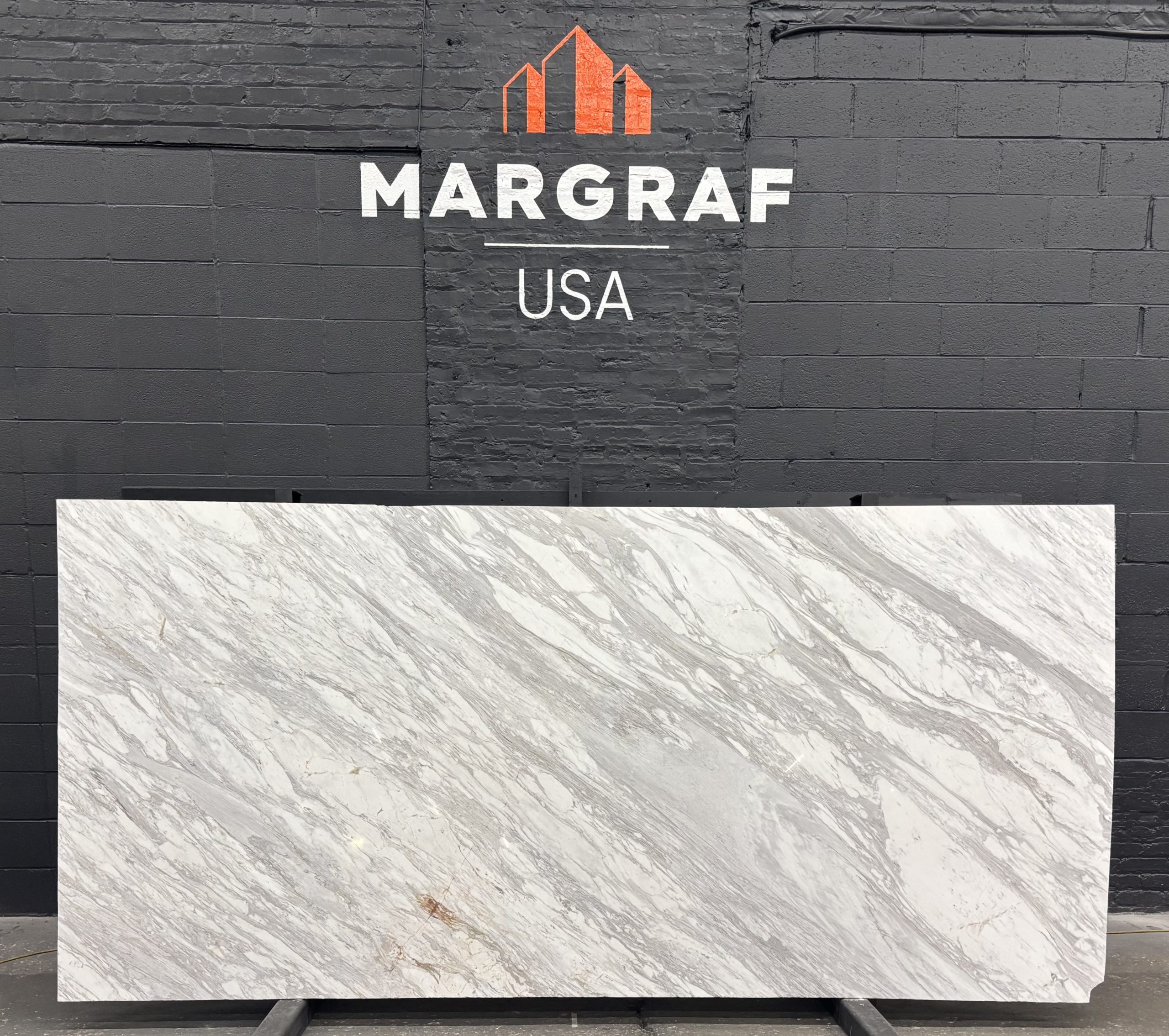
– Bianco Carrara: The timeless white‑grey with calm veining; a safe, sophisticated choice for floors, baths, and stairs when quiet elegance is the brief.
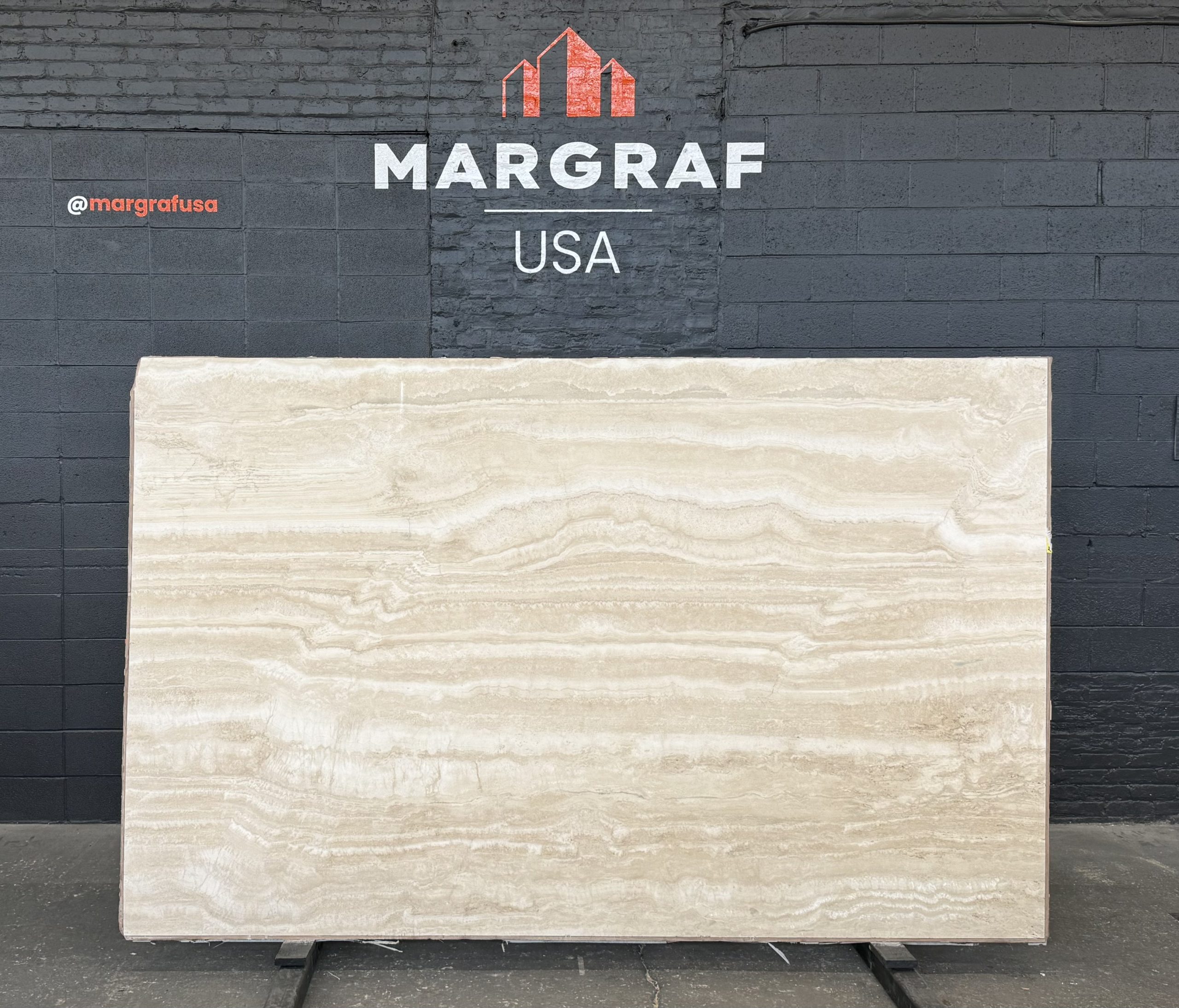
– Travertino Bianco: A textural white neutral with a full finish palette (from polished to bush‑hammered/sandblasted) for calm, continuous surfaces. Best for: interior floors/walls, exterior cladding (finish‑specific).
– Venus: Bright white with delicate grey veining; especially effective on luminous indoor flooring in polished or honed. Best for: galleries, retail, refined residential circulation.
Blues & Greens for Biophilic Statements
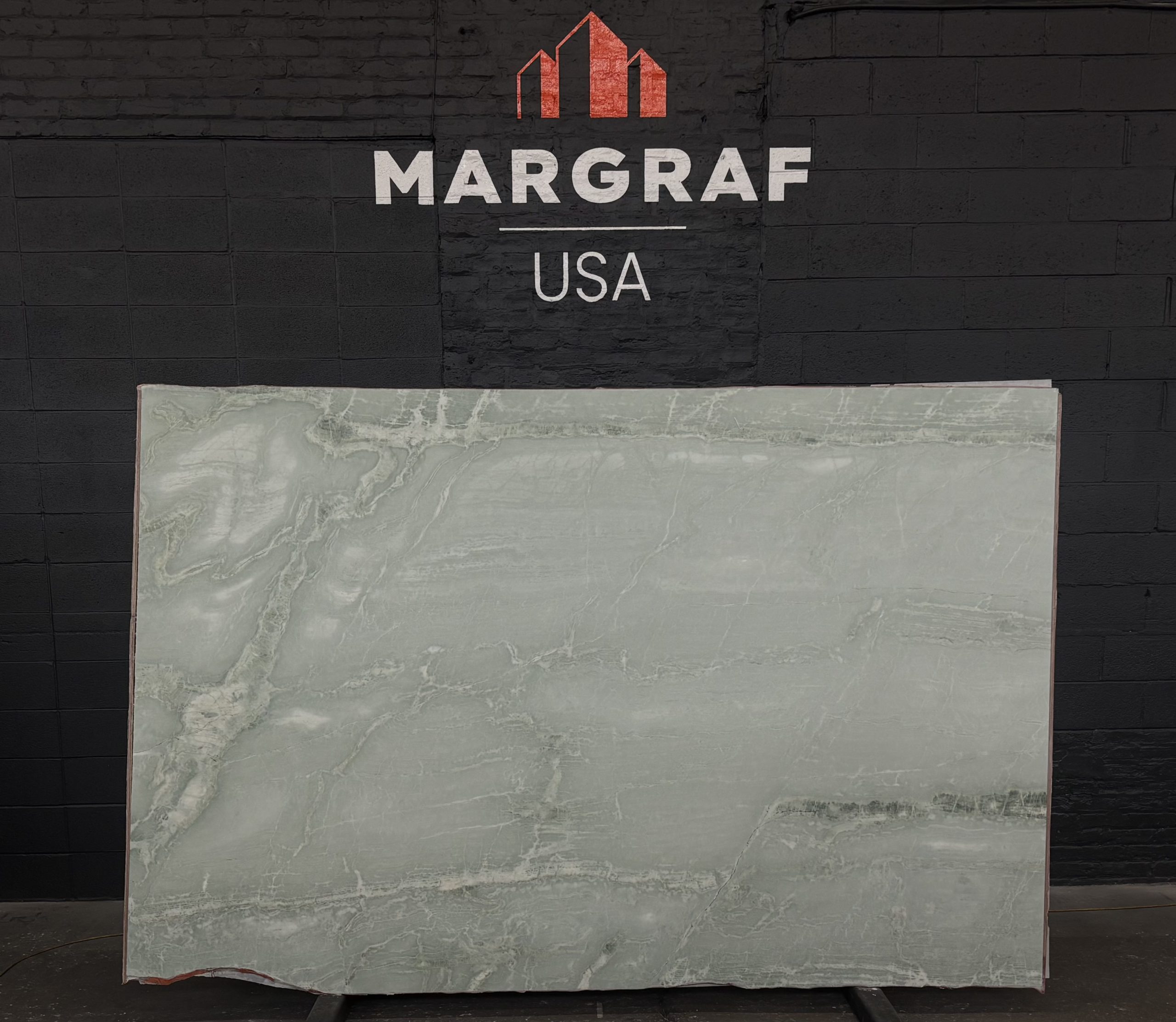
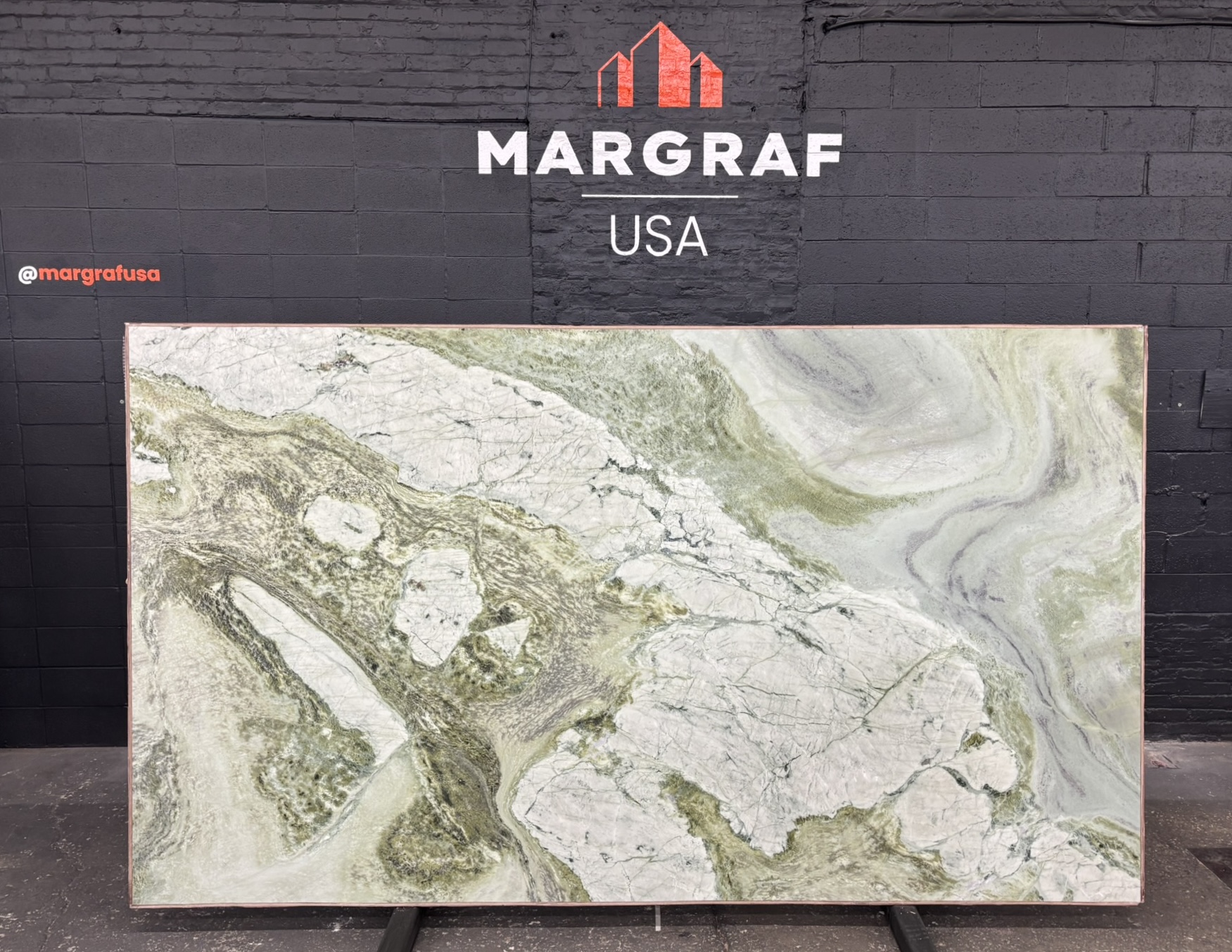
– Aquamarina: A fresh aquamarine‑green field with fine white veining. Serene in tone, strong in performance. Best for: spa‑like baths, tables, feature walls where you want color without visual noise.
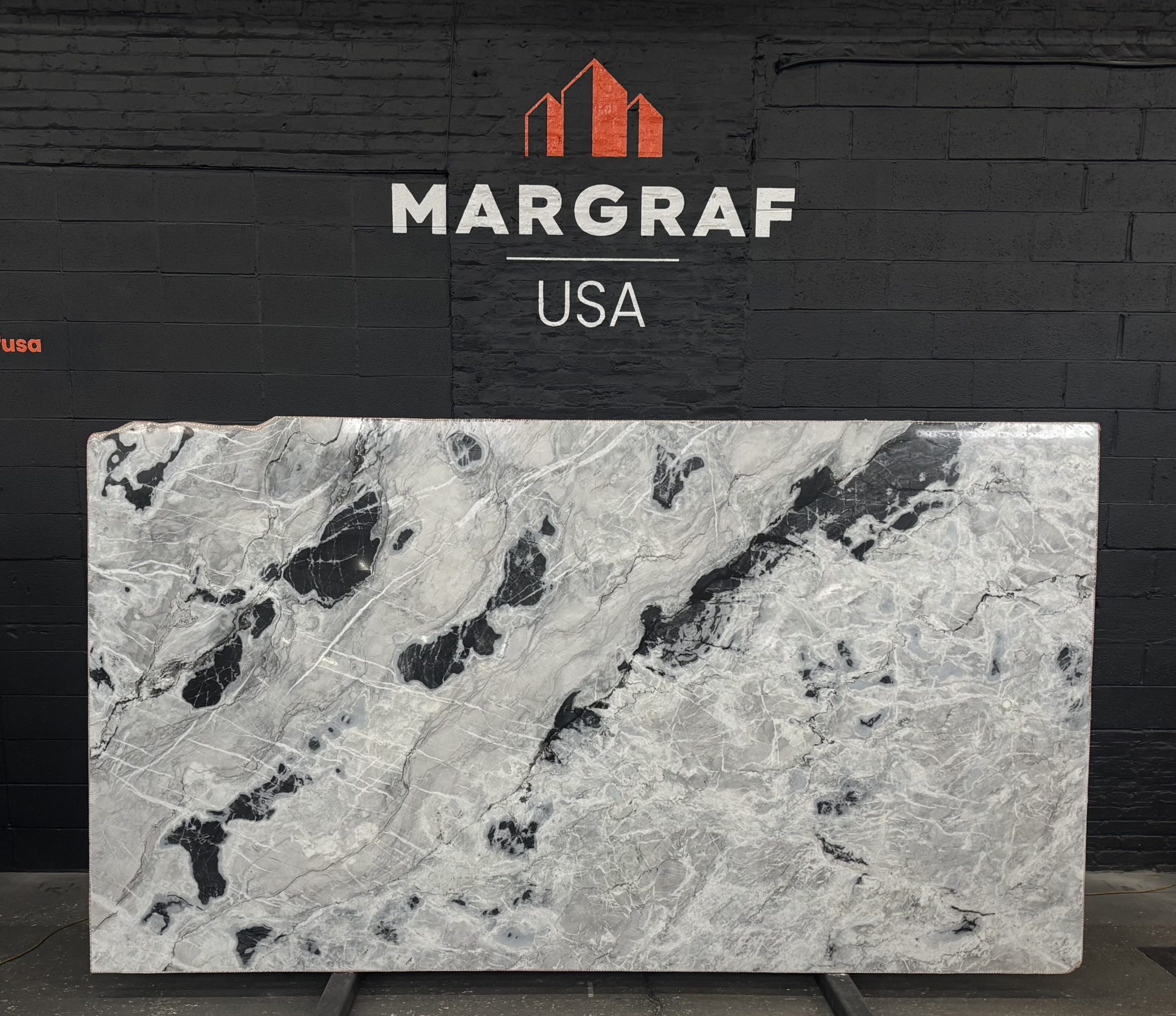
– Arctic Ocean: Graphic “glacial” movement, glacier‑greys laced with crisp whites and inky blacks, often in diagonal sweeps; seen from Canada and Brazil, and prized as a true quartzite for heat and scratch resistance on hardworking surfaces. Best for: kitchen countertops, vanities, feature panels and fireplaces (book‑matched).
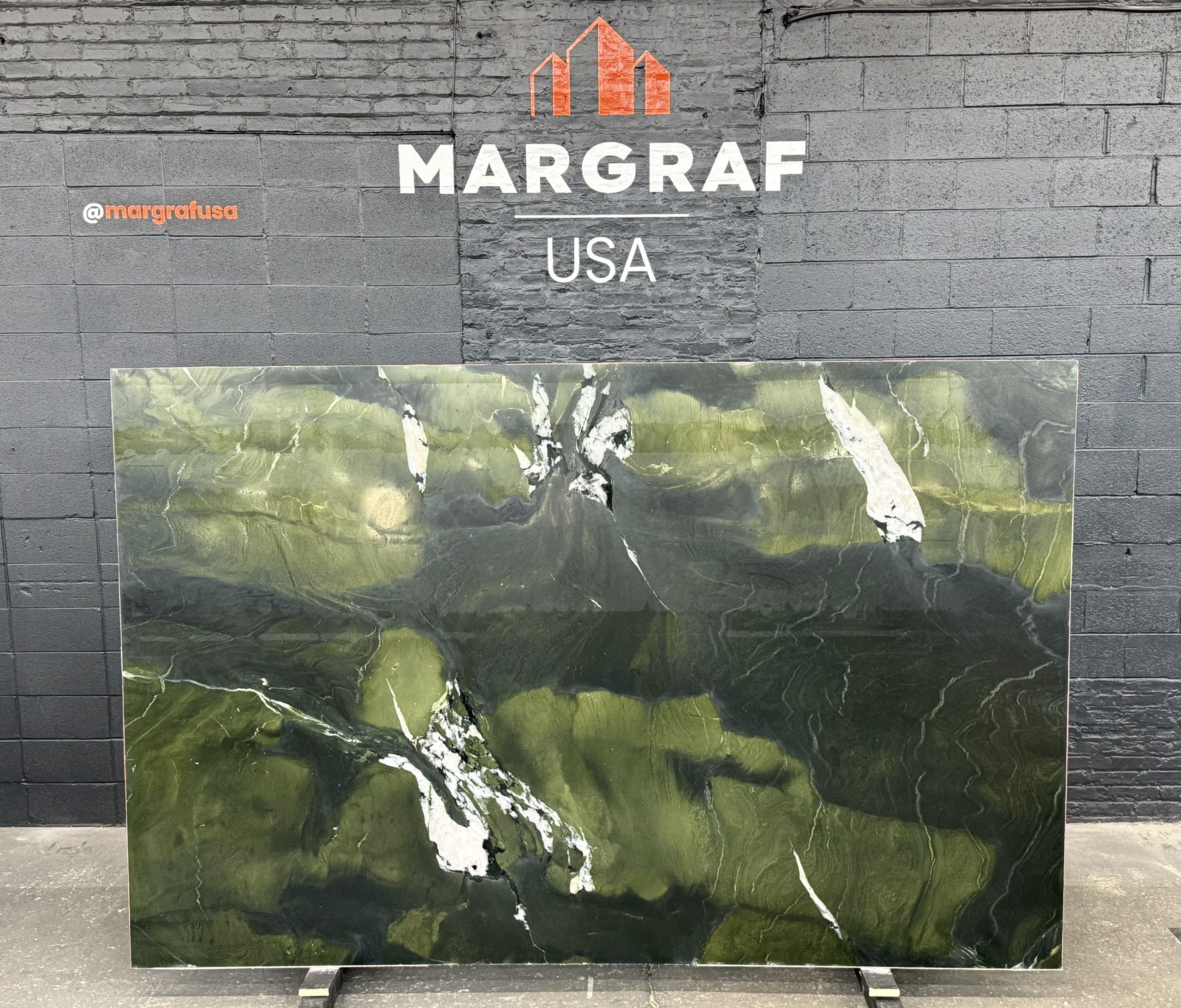
– Avocatus: Deep, dramatic Brazilian greens with shifting tonality; a resilient quartzite for daily use and yet bold enough to carry a space. Best for: statement walls, dining tables, kitchen islands.
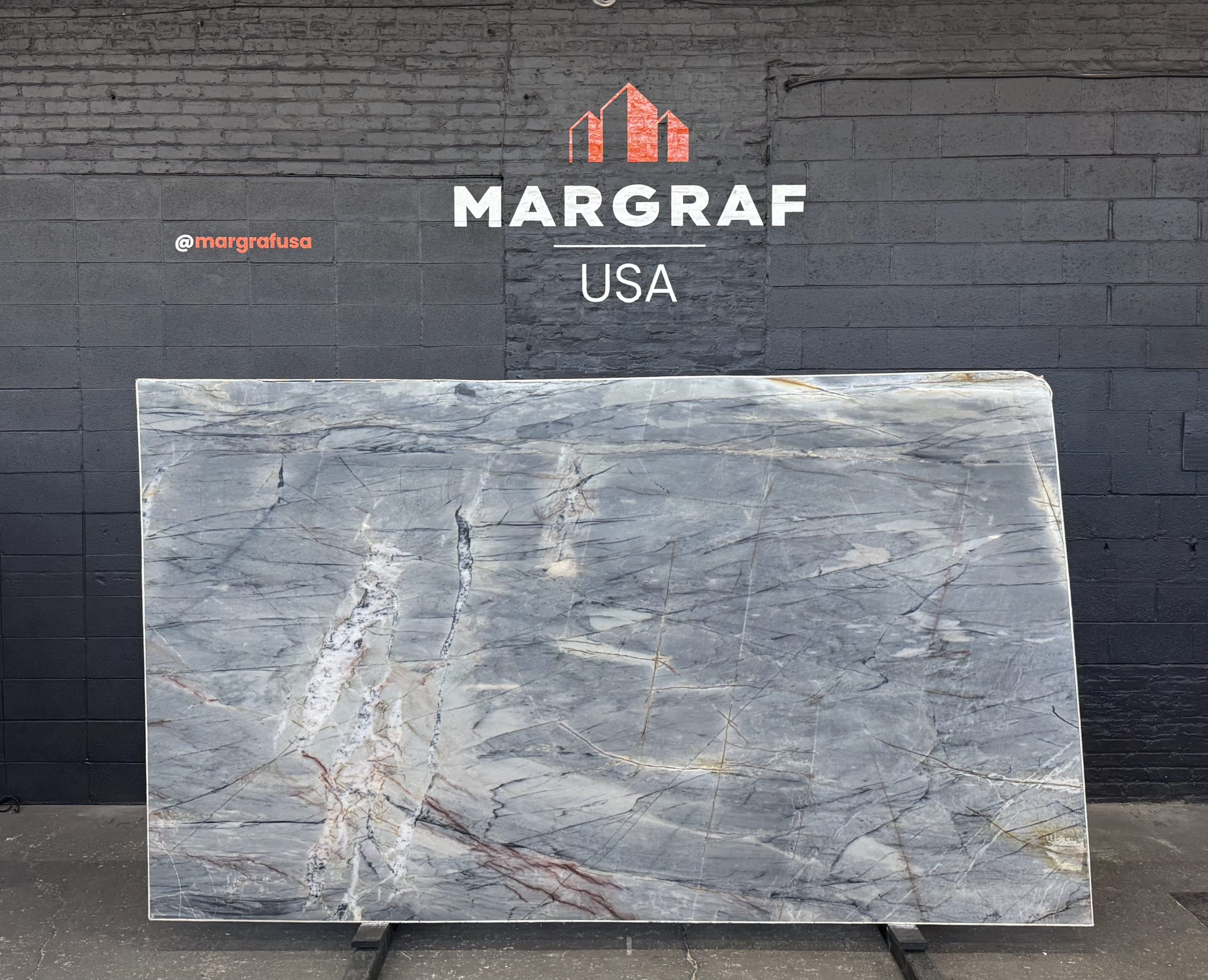
– Ijene Blue: Dark‑blue Brazilian quartzite (in polished/honed/brushed finishes) for elegant cladding, tables, and durable, design‑forward tops.
– Explosion Blue: A “symphony” of vibrant veining that turns fireplaces, double‑height walls and reception counters into focal points.
– Bleu de Savoie: Sophisticated grey‑blue tonality marble for serene floors or cladding with indoor/outdoor versatility.
– Sequoia Green: Forest‑rich greens with sculptural veins; visually compelling on floors, walls, or furniture volumes. A marble Best for: nature‑led hospitality, biophilic feature zones.
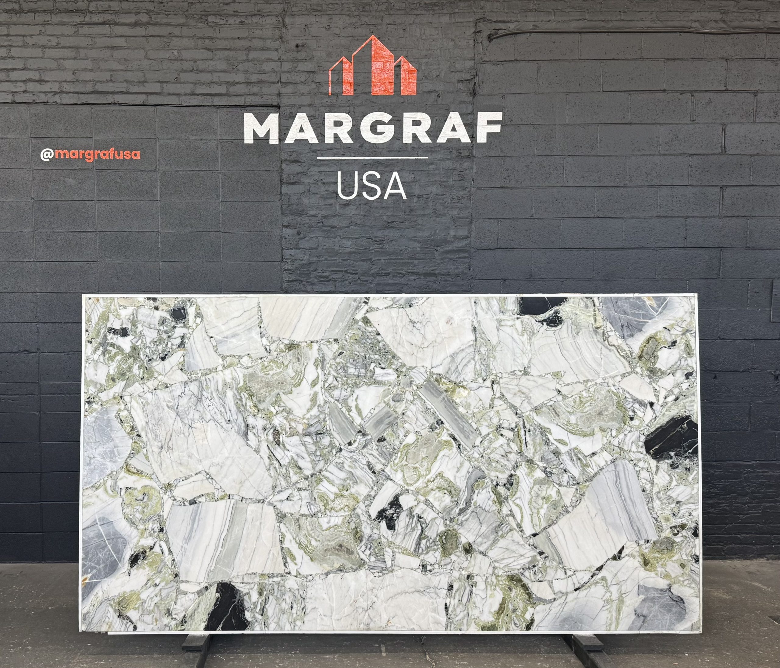
– White Beauty: A semi‑precious surface with emerald‑green tracery on a refined light base, backlighting reveals its depth. Best for: bars, reception desks, boutique retail.
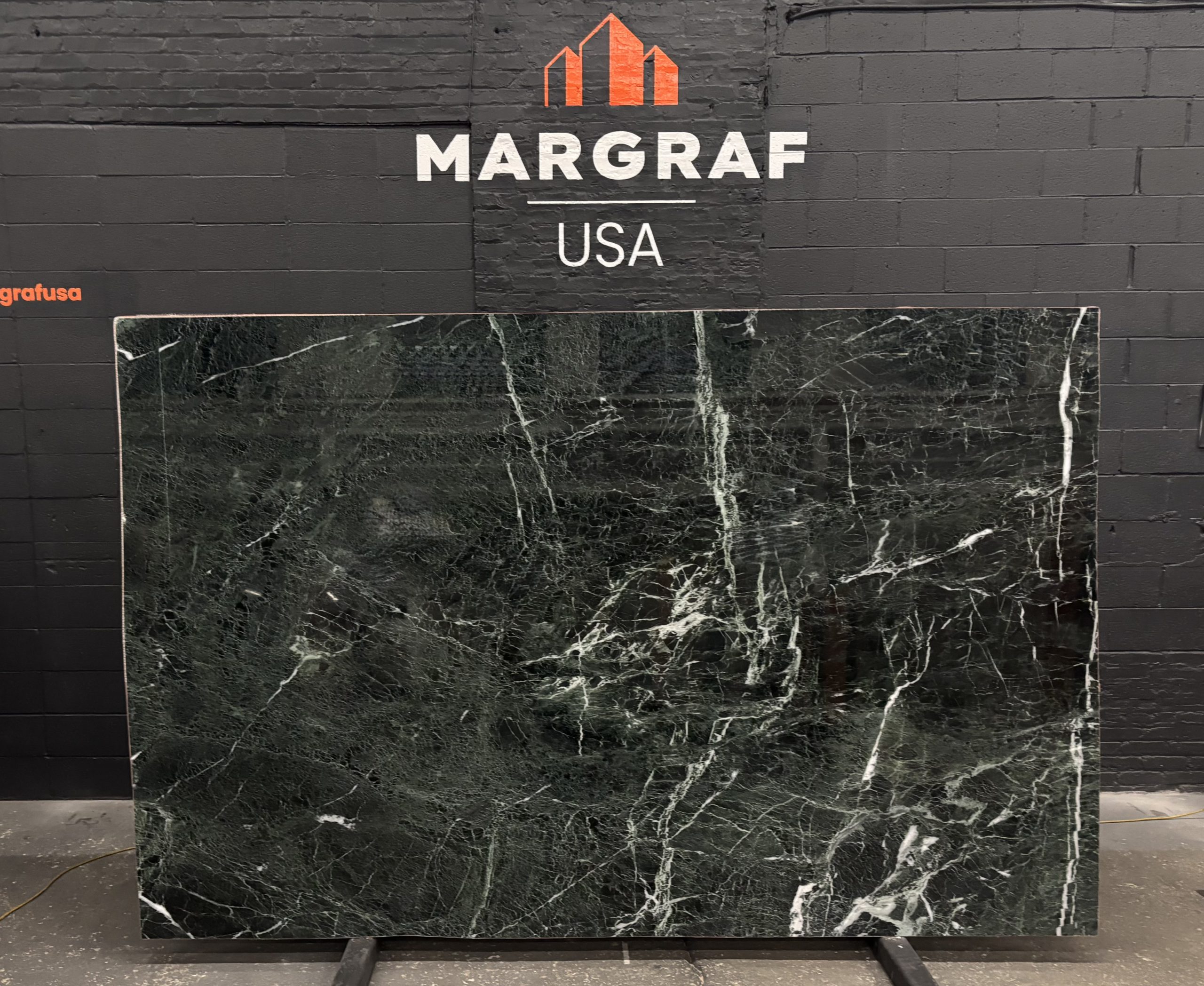
– Verde Alpi: A classic dark‑green marble with elegant, lighter veining. It brings heritage gravitas in a contemporary way when detailed with thin edges or large‑format panels. Best for: intimate bathrooms, dramatic fireplace surrounds, moody hospitality spaces.
Great spaces aren’t loud about their choices, they feel inevitable. After all the sketches and specs, material selection is ultimately a decision made by eye, by hand, and in the feasibility, light and scale the work will live in. That’s where the difference between almost right and exactly right reveals itself: the way a vein resolves across a waterfall edge, how a leathered finish quiets reflections, how bookmatched panels carry a line through the room.
Book an appointment with us at Margraf USA Stone & Design Lab located in 1439 W Hubbard St, to compare slabs side‑by‑side, get the best recommendations from our team experts, confirm veins and edges, and choose finishes under real light. Note: Bring your ideas, drawings, palettes, and questions! Visit the showroom to select your slab and start developing your project with our team.