Natural Stone Market Trends 2026: Six Editorial Heroes Shaping the Year
If 2025 was about rediscovering warmth and personality, 2026 is the year design fully commits to touchable materials, layered palettes, and unapologetically expressive surfaces. Editors and specifiers are speaking the same language: statement stone, deeper warm tones, and materials that are honest enough to age in plain sight. It’s a moment made for natural stone.
Across residential and commercial work alike, bold veining and sculptural slabs are stepping forward, often framed by jewel‑tone accents, greens that ground a room like a forest floor; reds that deliver the kind of editorial punctuation once reserved for art. Kitchens and hospitality spaces, always bellwethers for broader taste, are where these ideas first take root: monolithic islands, backlit bars, and focal walls that read like installations rather than mere finishes.
Below, Margraf USA spotlights six materials that embody this shift. Each offers its own character and performance profile, yet all share an ability to feel current without displacing time‑tested values.
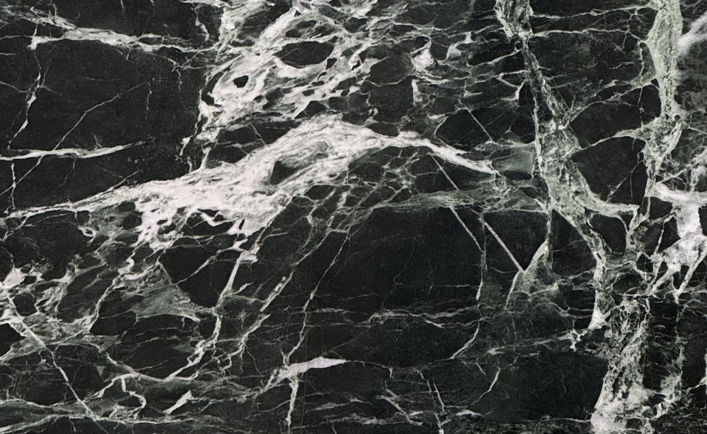
1) VERDE ALPI – the modern green classic: What was once a trend color has matured into a modern neutral, a sophisticated counterpoint to warm woods and unlacquered brass. Quarried in the Aosta Valley, its dark ground and bright, irregular veining feel tailored rather than theatrical, whether polished, honed, or brushed. Designers reach for it when they want biophilic drama without losing restraint, think book‑matched islands, waterfall edges, and moody fireplace surrounds that command a room.
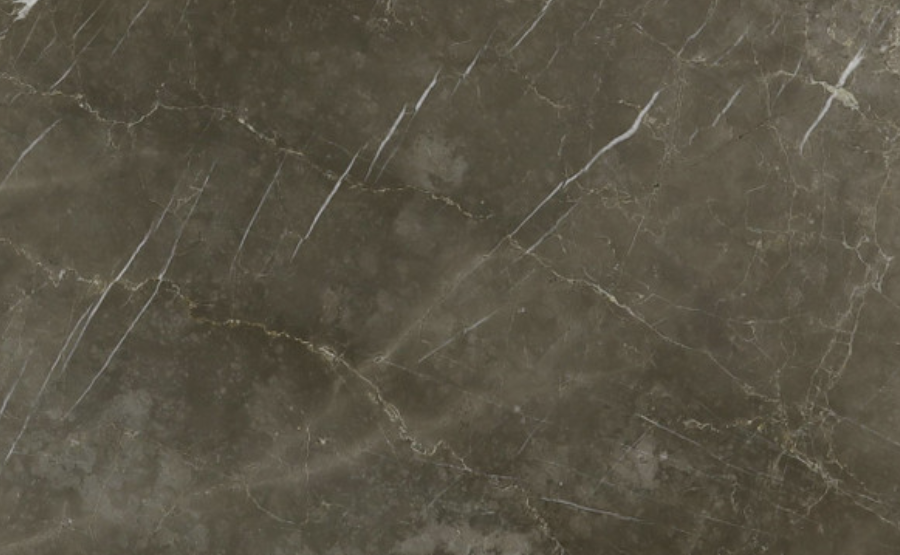
2) GRIGIO COLLEMADINA – Tuscan greys with quiet movement: Refines grey for a warmer decade. From Tuscany’s Garfagnana hills, its soft field and wispy white, with the occasional golden thread, create spaces that exhale. In practice it’s the marble for vanities and shower walls where spa calm matters, and for hospitality floors and feature walls that feel architectural, not decorative. Paired with wood and brass, it delivers the longevity and quiet gravity specifiers want in 2026.
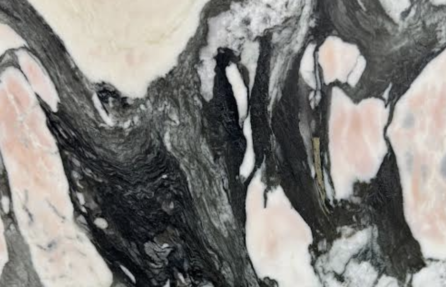
3) NOTRE DAME – graphic. editorial marble for statement zones: Turns the “statement stone” idea into a design grammar. With alternating passages of white, black, pink, and deep grey, it’s unmistakably natural yet fashion‑forward, especially on vertical planes. Because the material carries so much of the visual conversation, it thrives where ornament is minimal, reception desks, elevator lobbies, corridor runs with gallery lighting, and powder rooms that perform like small theaters. Used judiciously, Notre Dame is not backdrop but protagonist.
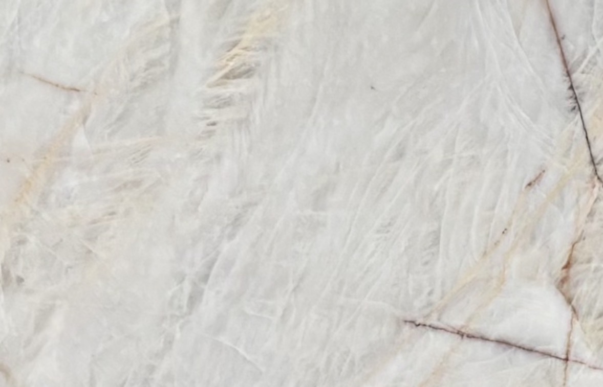
4) CRISTALLO – translucent luxury engineered by nature: Proves that material honesty can be spectacular. Hard, crystalline, and partially translucent, it invites backlighting that makes surfaces glow from within while staying serviceable for bars, islands, and other high‑touch areas. With high‑CRI LEDs and proper diffusion, Cristallo becomes a finish in its own right, imparting a slow, ambient radiance that photographs beautifully and lives even better.
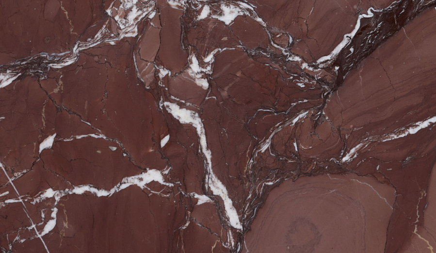
5) ROSSO CARDINALE – the return of rich reds: Alongside green’s renaissance, red marbles are reclaiming their confidence. A deep cardinal hue threaded with fine white veining, it delivers warmth with discipline, less shout, more resonance. Designers use it for boutique counters, tabletops, and café bars where a jewel‑tone accent lifts the entire scene; at home, it’s an opulent fireplace surround, especially beside walnut and non-lacquered brass. The effect is heritage‑meets‑modern: saturated, sensorial, tuned for atmospheric light.
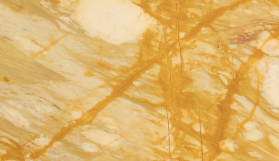
6) GIALLO SIENA – sun-warned gold for layered lived-in luxury: brings sun‑warmed gold to layered, lived‑in luxury. From the Siena region, its ivory base and saffron‑to‑bronze veining offer glow rather than glare, making it ideal for dramatic cladding, furniture‑grade islands, and consoles that read like jewelry for the room. It rewards both polished and honed treatments; in baths, pair with brushed brass and travertine for tonal Mediterranean warmth. In busy kitchens, modern anti‑etch care preserves finish while allowing a gentle patina.
Taken together, these materials chart the year’s direction. Warmer narratives are overtaking cooler ones, not as rejection but rebalancing, golden marbles, warm greys, and saturated greens and reds add depth to both quiet and maximal palettes. Sculptural veining becomes focal art; islands and vertical surfaces carry drama once left to wallcovering or millwork. Authenticity remains the north star: stones that show their geology, invite touch, and age with grace feel more credible than ever. And lighting has matured from accessory to collaborator, especially in backlit applications where quartzites like Cristallo deliver true durability.
Whether the brief is a boutique lobby with unmistakable identity, an atelier‑style kitchen with a monolithic centerpiece, or a residence shaped by light and shadow, these six stones express the mood of 2026, more personal, layered, more material‑forward. When you’re ready to explore how they can anchor your next project, our team can support with slab viewings, samples, finish guidance, and illuminated mockups tailored to your palette.
We’ll be tracking engagement on this feature and sharing which stone emerges as the most‑clicked choice. The results will be posted in the next few days, check back to see where the market’s eye is landing!